Best Use of Tailwind CSS with React
Last updated 3rd March. 2025
Want to know about Tailwind CSS with React Then you are at the right place, this article will guide you through it in detail.

About The Author
Sai Ram Soma Having 12+ years of IT experience in React JS & Native, JavaScript, Typescript. Working in a startup from day one. Accustomed to learning and keeping up with the current trend. Experience in developing feature rich web applications using React JS. Experience in developing mobile applications in Android, React Native.

Contents


Introduction to Best use of Tailwind CSS with React

Tailwind CSS is a utility-first CSS framework that allows you to build custom designs directly in your HTML or JSX.
Unlike traditional CSS frameworks that provide pre-designed components, Tailwind offers low-level utility classes that you can combine to create unique styles.
This makes it highly flexible and perfect for use with React, where you can dynamically apply classes based on state or props.
When using Tailwind with React, you can easily style your components by adding Tailwind classes directly to your JSX elements.
For example, you can create a button with padding, background color, and rounded corners by simply writing <button className=”px-4 py-2 bg-blue-500 rounded”>Click Me</button>.
This approach keeps your styles in line with your components, making it easier to manage and maintain your code. Plus, Tailwind’s responsive design utilities and dark mode support make it a great choice for modern web applications.
What is React JS
React JS (React JavaScript) is an open-source JavaScript library used for building user interfaces, particularly for single-page applications where efficient and dynamic UI rendering is required. Developed and maintained by Facebook (now Meta), React is widely used for creating fast, scalable, and interactive web applications.
Key Features of React JS:
React applications are built using reusable components, which help in maintaining and scaling large applications efficiently.
React uses a virtual DOM to optimize rendering and enhance performance. Instead of re-rendering the entire page, it updates only the necessary parts of the UI.
React makes it easy to design interactive user interfaces using a declarative approach, where the UI changes dynamically in response to data changes.
JSX is a syntax extension that allows developers to write HTML-like code inside JavaScript. It makes UI development more readable and structured.
React efficiently manages component data through state and props, enabling dynamic content rendering.
React provides hooks like useState, useEffect, and useContext, which simplify state management and component logic in functional components.
Allows seamless navigation between different pages or views within an application, enhancing the user experience.
React has a vast ecosystem, including libraries like Redux for state management and Next.js for server-side rendering (SSR).
How to set up React Project
Setting up a React project is straightforward, especially with tools like Create React App or Vite.
- Install Node.js: Ensure you have Node.js installed on your computer. You can download it from nodejs.org.
- Create a React Project:
- Using Create React App (CRA):
Open your terminal and run:
- Using Create React App (CRA):
npx create-react-app my-app
- Replace my-app with your desired project name. This sets up a React project with all the necessary files and dependencies.
- Using Vite (a faster alternative):
Run:
npm create vite@latest my-app
3. Navigate to Your Project:
Move into your project folder:
cd my-app
4. Start the Development Server:
Run:
npm run dev
(for Vite) or:
npm start
(for CRA). This will start a local server, and you can view your app in the browser at http://localhost:3000.
Start Coding:
Open the project in your favorite code editor (e.g., VS Code) and begin building your React components in the src folder.
What is Tailwind CSS ?

Tailwind CSS is a highly popular utility-first CSS framework that allows developers to quickly build modern, responsive, and highly customizable user interfaces.
Unlike traditional CSS frameworks like Bootstrap, which provides pre-designed components, Tailwind CSS provides low-level utility classes that can be used to style elements directly within HTML or JSX.
Key Features of Tailwind CSS:
- Every style is a small, reusable class (e.g., flex, mt-4, text-center).
- Built-in support for responsive layouts (e.g., md:text-lg for medium screens).
- You can configure colors, spacing, fonts, and more in the tailwind.config.js file.
- Easy dark mode support with classes like dark:bg-gray-800.
- Tailwind purges unused CSS in production, keeping file sizes small.
How to Use Tailwind CSS :
1. Install Tailwind CSS
You can add Tailwind to your project in a few ways:
Using npm or yarn (for React, Vue, etc.):
Run the following commands in your project folder:
npm install -D tailwindcss postcss autoprefixer
npx tailwindcss init
This installs Tailwind and generates a tailwind.config.js file.
Using a CDN (quick setup for simple projects):
Add this to your HTML file’s <head>:
<link href=”https://cdn.jsdelivr.net/npm/tailwindcss@3.4.1/dist/tailwind.min.css” rel=”stylesheet”>
Run HTML
2 . Configure Tailwind
If you installed Tailwind via npm, create a tailwind.config.js file (if it doesn’t already exist) and configure it:
module.exports = {
content: [“./src/**/*.{html,js,jsx,ts,tsx}”], // Add paths to your template files
theme: {
extend: {},
},
plugins: [],
};
3. Add Tailwind to Your CSS
Create a CSS file (e.g., src/index.css or src/App.css) and add the following:
@tailwind base;
@tailwind components;
@tailwind utilities;
Then, import this file into your main JavaScript or React entry file (e.g., src/index.js or src/main.jsx):
import ‘./index.css’;
4. Start Using Tailwind Classes
Now you can use Tailwind’s utility classes directly in your HTML or JSX. For example:
HTML Example
<div class=”p-4 bg-blue-500 text-white text-center”>
Hello, Tailwind!
</div>
React Example:
function App() {
return (
<div className=”p-4 bg-blue-500 text-white text-center”>
Hello, Tailwind!
</div>
);
}
5. Customize Tailwind (Optional)
You can customize Tailwind by editing the tailwind.config.js file. For example:
module.exports = {
theme: {
extend: {
colors: {
‘custom-blue’: ‘#1fb6ff’,
},
},
},
};
Now you can use bg-custom-blue in your classes.
6. Build for Production
Tailwind automatically removes unused CSS in production. If you’re using a build tool like Vite or Webpack, run:
npm run build
This will generate an optimized CSS file with only your preferred styles.
Example: A Simple Button
<button class=”px-4 py-2 bg-blue-500 text-white rounded hover:bg-blue-600″>
Click Me
</button>
Run HTML
Installation Process of Tailwind :
Step 1: Set Up a React Project
If you don’t already have a React project, create one using Create React App or Vite:
Using Create React App:
npx create-react-app my-app
cd my-app
Using Vite:
npm create vite@latest my-app
cd my-app
npm install
Step 2: Install Tailwind CSS
Install Tailwind CSS and its dependencies (PostCSS and Autoprefixer) using npm or yarn:
npm install -D tailwindcss postcss autoprefixer
Or with yarn:
yarn add -D tailwindcss postcss autoprefixer
Step 3: Initialize Tailwind CSS
Generate the tailwind.config.js and postcss.config.js files:
npx tailwindcss init -p
This creates:
- tailwind.config.js: For customizing Tailwind’s default configuration.
- postcss.config.js: For processing Tailwind’s CSS.
Step 4: Configure Tailwind
Open the tailwind.config.js file and configure the content property to include paths to your template files. This ensures Tailwind scans your files for class usage and removes unused styles in production.
module.exports = {
content: [
“./src/**/*.{js,jsx,ts,tsx}”, // Include all JS/JSX/TS/TSX files in the src folder
],
theme: {
extend: {},
},
plugins: [],
};
Step 5: Add Tailwind to Your CSS
Create a CSS file (e.g., src/index.css or src/App.css) and add the following Tailwind directives:
@tailwind base;
@tailwind components;
@tailwind utilities;
Then, import this CSS file into your main JavaScript or React entry file (e.g., src/index.js or src/main.jsx):
import ‘./index.css’;
Step 6: Start Using Tailwind
Now you can use Tailwind’s utility classes in your React components. For example:
function App() {
return (
<div className=”p-4 bg-blue-500 text-white text-center”>
Hello, Tailwind CSS!
</div>
);
}
export default App;
Step 7: Run Your Project
Start your development server to see Tailwind in action:
For Create React App:
npm start
For Vite:
npm run dev
Visit http://localhost:3000 in your browser to see your styled React app.
Step 8: Build for Production
When you’re ready to deploy, run the build command to generate an optimized production build:
For Create React App:
npm run build
For Vite:
npm run build
Tailwind will automatically remove unused CSS, ensuring your production build is as small as possible.
Optional: Customize Tailwind
You can customize Tailwind by editing the tailwind.config.js file. For example, to add custom colors:
module.exports = {
theme: {
extend: {
colors: {
‘custom-blue’: ‘#1fb6ff’,
},
},
},
};
Now you can use bg-custom-blue in your classes.
or want to continue reading about Best use of Tailwind CSS with React
Best Tailwind CSS Tutorial

Step 1: Set Up Tailwind CSS
If you haven’t already, set up Tailwind CSS in your project. Follow the installation steps mentioned earlier.
Step 2: Understand Tailwind’s Utility Classes
Tailwind uses utility classes to style elements. Each class corresponds to a specific CSS property. For example:
- p-4 → padding: 1rem;
- bg-blue-500 → background-color: #3b82f6;
- text-white → color: white;
You combine these classes to create custom designs.
Step 3: Build a Simple Card Component
Let’s create a responsive card component using Tailwind CSS.
HTML/JSX Code
<div class=”max-w-sm mx-auto bg-white shadow-lg rounded-lg overflow-hidden”>
<img class=”w-full h-48 object-cover” src=”https://via.placeholder.com/400″ alt=”Card Image”>
<div class=”p-6″>
<h2 class=”text-xl font-bold text-gray-800″>Card Title</h2>
<p class=”mt-2 text-gray-600″>
This is a simple card component built with Tailwind CSS. It’s fully responsive and easy to customize.
</p>
<div class=”mt-4″>
<a href=”#” class=”inline-block px-4 py-2 bg-blue-500 text-white rounded hover:bg-blue-600″>
Learn More
</a>
</div>
</div>
</div>
Run HTML
Step 4: Explanation of the Code
Container :
- max-w-sm: Sets the maximum width of the card.
- mx-auto: Centers the card horizontally.
- bg-white: Sets the background color to white.
- shadow-lg: Adds a large shadow.
- rounded-lg: Adds large rounded corners.
- overflow-hidden: Ensures the image doesn’t overflow the card.
Image :
- w-full: Makes the image take the full width of the card.
- h-48: Sets a fixed height for the image.
- object-cover: Ensures the image covers the area without distortion.
Contetn :
- p-6: Adds padding around the content.
- text-xl: Sets the font size to extra large.
- font-bold: Makes the text bold.
- text-gray-800: Sets the text color to dark gray.
- mt-2: Adds margin-top to the paragraph.
- text-gray-600: Sets the paragraph text color to gray.
Button :
- inline-block: Makes the button an inline-block element.
- px-4 py-2: Adds horizontal and vertical padding.
- bg-blue-500: Sets the background color to blue.
- text-white: Sets the text color to white.
- rounded: Adds rounded corners.
- hover:bg-blue-600: Changes the background color on hover.
javascriptCopy codeimport { Provider } from ‘react-redux’;
import App from ‘./App’;
import store from ‘./store’;
const Root = () =>
(
<Provider store={store}>
<App />
</Provider>
);
Step 5: Make It Responsive
Tailwind makes it easy to create responsive designs. For example, you can change the card’s width on larger screens:
<div class=”max-w-sm md:max-w-md lg:max-w-lg mx-auto bg-white shadow-lg rounded-lg overflow-hidden”>
<!– Rest of the card code –>
</div>
Run HTML
- md:max-w-md: Set the max width to md on medium screens.
- lg:max-w-lg: On large screens, set the max width to lg.
Step 6: Customize Tailwind (Optional)
You can customize Tailwind by editing the tailwind.config.js file. For example, to add custom colors:
module.exports = {
theme: {
extend: {
colors: {
‘custom-blue’: ‘#1fb6ff’,
},
},
},
};
Now you can use bg-custom-blue in your classes.
Step 7: Build for Production
When you’re ready to deploy, run the build command to generate an optimized production build:
For Create React App:
npm run build
for Vite :
npm run build
Tailwind will automatically remove unused CSS, ensuring your production build is as small as possible.
Step 8: Explore Mode
Tailwind CSS has a lot more to offer, including:
- Dark Mode: Use dark: prefix for dark mode styles.
- Animations: Add animations using animate-* classes.
- Plugins: Extend Tailwind with plugins like @tailwindcss/forms or @tailwindcss/typography.
What are the Best Practices for Using Tailwind CSS in a React Project
- Leverage Tailwind’s utility classes instead of writing custom CSS.
- Break UI elements into small, reusable React components.
- Use Tailwind’s @apply for Repeated Styles – Avoid class repetition by using @apply in a separate CSS file.
- Tailwind automatically removes unused CSS in production; configure it in tailwind.config.js.
- Customize colors, spacing, and fonts using the extend option in the config file.
- Use Tailwind with UI libraries like Headless UI or DaisyUI for faster development.
- Enable darkMode: “class” for better theme toggling control.
- Use Tailwind’s flexbox and grid utilities for responsive designs.
- Optimize Class Names with clsx or classnames – These libraries help manage conditional class application.
- Stick to Tailwind’s predefined spacing, typography, and colors for a uniform UI
Tailwind CSS vs Bootstrap
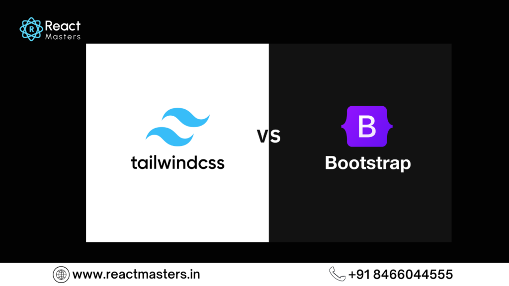
| Feature | Tailwind | Bootstrap |
|---|---|---|
| Approach | Utility-first (build your own components) | Pre-designed components (ready to use) |
| Customization | Highly customizable via tailwind.config.js | Customizable but limited to predefined themes |
| CSS File Size | Smaller in production (unused styles purged) | Larger due to built-in styles and components |
| Flexibility | High – No predefined styles, fully customizable | Moderate – Predefined styles may need overriding |
| Responsiveness | Built-in responsive utilities (sm, md, lg, etc.) | Uses a grid system and breakpoints |
| Ease of Use | Requires learning utility classes | Easier with prebuilt UI components |
| Components Based | works well with React,Vue and mordern frame works | comes with Built-in UI Components |
| Performance | It is more optimized as it removes unused CSS | Heavier due to bundled styles and scripts |
| JavaScript Dependency | No built-in JavaScript; uses only CSS classes | Requires JavaScript for some components (e.g., modals, tooltips) | Best For | Developers who prefer full design control | Quick prototyping and ready-to-use designs |
How to Integrate Tailwind CSS with React
- Create a React Project—If you haven’t already, create a React app using Create React App or Vite.
- Install Tailwind CSS – Install Tailwind and required dependencies using npm or yarn.
- Initialize Tailwind Configuration – Generate tailwind.config.js and postcss.config.js files.
- Configure Tailwind – Add paths to your React components in the content section of tailwind.config.js.
- Include Tailwind in CSS – Import Tailwind directives (@tailwind base;, @tailwind components;, @tailwind utilities;) in the main CSS file.
- Start Using Tailwind Classes – Use Tailwind’s utility classes directly in JSX for styling.
- Run the React App – Start the development server and test Tailwind styles in your components.
- Optimize for Production – Tailwind will automatically remove unused styles when building the project.
Building a Responsive Navbar with Tailwind CSS and React
- Set Up React and Tailwind CSS – Ensure Tailwind CSS is properly installed in your React project.
- Create a Navbar Component – Make a separate Navbar.js file for better code organization.
- Use Flexbox for Layout – Utilize Tailwind’s flex, justify-between, and items-center classes for alignment.
- Add Navigation Links – Use ul and li elements with Tailwind classes for styling.
- Make It Responsive – Use hidden md:flex to show/hide menu items on different screen sizes.
- Add a Mobile Menu Button – Implement a hamburger button using Tailwind’s block md:hidden classes.
- Toggle Mobile Menu – Use React state (useState) to show/hide the menu on mobile screens.
- Apply Smooth Animations – Use Tailwind’s transition and duration utilities for better user experience.
- Ensure Accessibility – Add aria-labels for buttons and menus to improve accessibility.
- Test on Different Devices – Check responsiveness by resizing the browser or using developer tools.
Conclusion:
Integrating Tailwind CSS with React is a powerful combination for building modern, responsive, and highly customizable user interfaces.
Tailwind’s utility-first approach allows you to style components directly in your JSX, making the development process faster and more efficient.
By following the steps outlined above, you can easily set up Tailwind in your React project, customize it to fit your design needs, and create scalable, maintainable applications.
Whether you’re building a small project or a large-scale application, Tailwind CSS provides the flexibility and control you need to create unique designs without writing custom CSS.
Its responsive utilities, dark mode support, and PurgeCSS optimization make it a great choice for modern web development.
FAQ's (Frequently asked Questions)
Best use of Tailwind with CSS
Tailwind CSS is a utility-first CSS framework that provides low-level utility classes to build custom designs directly in your HTML or JSX. Unlike traditional frameworks like Bootstrap, it doesn’t include pre-designed components but allows you to create unique designs by combining utility classes.
- Tailwind CSS: Utility-first, highly customizable, and encourages unique designs by combining utility classes.
- Bootstrap: Component-based, provides pre-designed components, and is better for rapid prototyping with consistent designs.
Yes, Tailwind CSS works seamlessly with React. You can apply Tailwind’s utility classes directly to JSX elements using the className attribute.
You can customize Tailwind by editing the tailwind.config.js file. For example, you can add custom colors, fonts, or breakpoints in the theme section.
In development, Tailwind generates a large CSS file. However, in production, it uses PurgeCSS to remove unused styles, resulting in a much smaller file size.
Tailwind provides responsive utility classes with prefixes like sm:, md:, lg:, and xl: . For example, md:text-center applies text alignment only on medium screens and above.
Yes, Tailwind CSS is framework-agnostic and can be used with any JavaScript framework, including Vue, Angular, Svelte, and more.
When using Tailwind CSS with React components, follow these best practices:
- Use Utility-First Approach – Leverage Tailwind’s utility classes directly in JSX for styling instead of creating separate CSS files.
- Extract Reusable Components – Create reusable React components for commonly used UI elements to maintain consistency.
- Leverage Tailwind’s Variants – Utilize
hover:,focus:,md:, etc., to keep styles responsive and dynamic. - Use
classnamesorclsx– For better readability and conditional styling, use libraries likeclassnamesorclsx. - Optimize for Performance – Purge unused styles by configuring Tailwind’s
purgeoption intailwind.config.js. - Customize with Config File – Modify the
tailwind.config.jsfile to extend themes, colors, and spacing for a more tailored design. - Use JIT Mode – Enable Tailwind’s Just-In-Time (JIT) mode for faster builds and better performance.
- Keep JSX Clean – If a component has too many utility classes, consider using
twMergeto simplify them.
Following these practices ensures a scalable, maintainable, and optimized development experience when working with Tailwind CSS in React.
PurgeCSS is a tool that removes unused CSS. Tailwind uses it in production builds to eliminate unused utility classes, reducing the final CSS file size.
Tailwind provides built-in dark mode support. Add the dark: prefix to your utility classes and enable dark mode in the tailwind.config.js file:
module.exports = {
darkMode: ‘class’, // or ‘media’
};
Use dark:bg-gray-800 for dark mode backgrounds.
Yes, Tailwind CSS is suitable for large projects. Its utility-first approach, combined with PurgeCSS, ensures scalability and maintainability. Customizing the tailwind.config.js file allows you to create a consistent design system.
Hope you found good understanding about Best use of Tailwind with CSS topic, with detailed explanations. Hope this helps you.